
Vodafone Redesign
Enhancing the user flow from discovery to checkout
This project aimed to simplify and streamline the Vodafone experience, guiding users effortlessly from browsing to checkout while reducing friction and boosting overall conversion.
Project Duration
2 weeks
Roles
UX/UI Design
Tools
Figma, Google Forms
June 2025
Project Goal
The goal was to streamline Vodafone’s shopping flow by identifying friction points across the browsing and checkout journey. The redesign aimed to improve clarity, reduce decision fatigue, and increase user conversion — all while maintaining brand consistency.

I redesigned the product comparison page to improve scannability, simplify the layout, and reduce visual clutter. Key pricing details and offers are now easier to digest, while cleaner UI cards and consistent spacing enhance usability
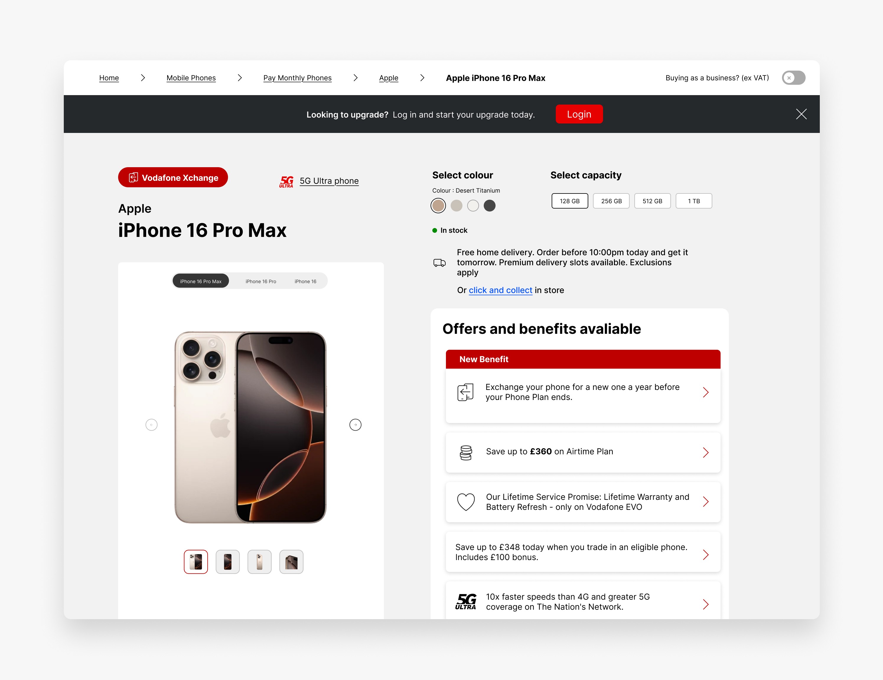
In this screen, I chose to display all available colours and capacities upfront rather than using dropdowns. This allows users to instantly see what’s in stock, reducing friction and enabling faster, more confident decision-making. The clean layout enhances visual clarity while keeping key actions easily accessible.
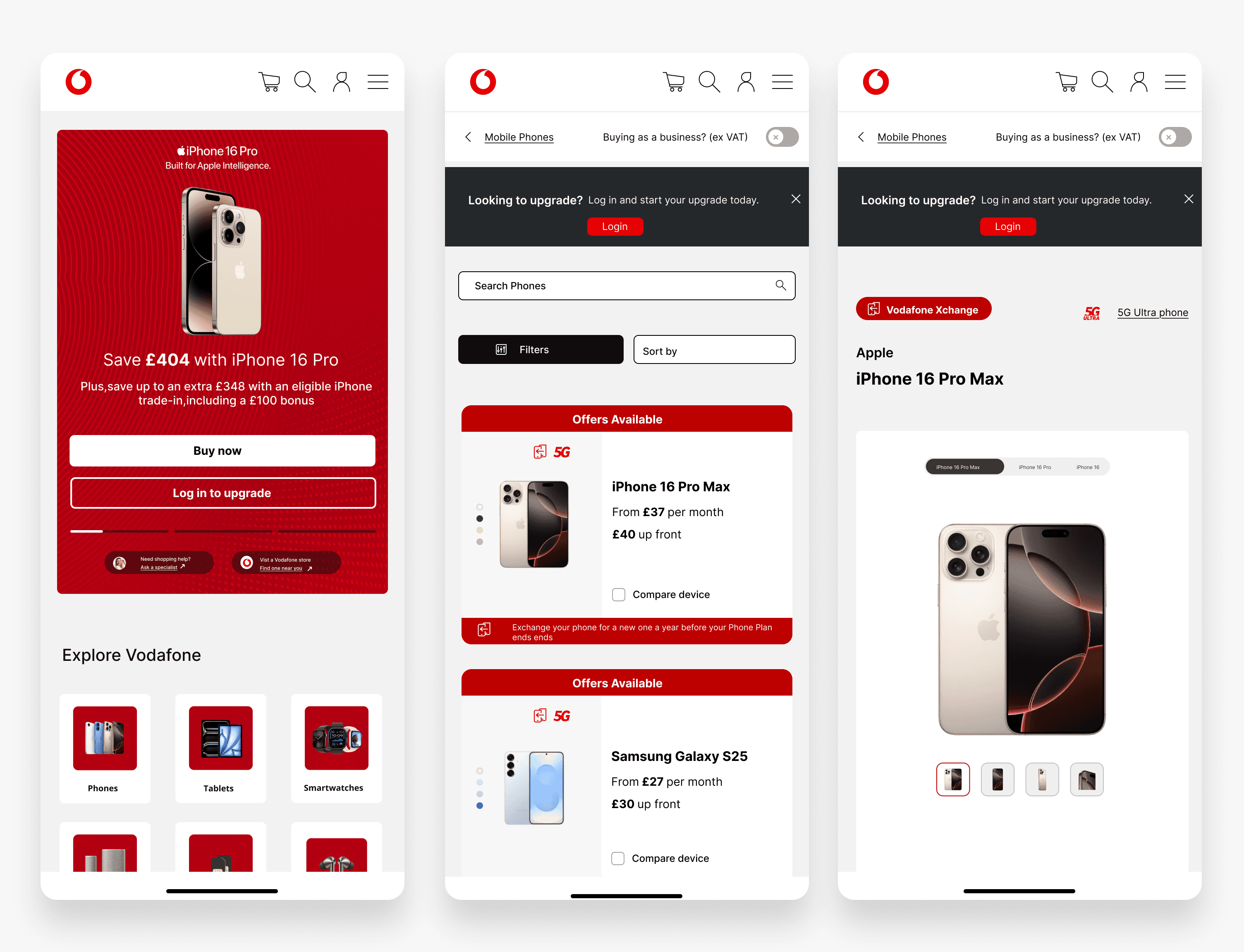
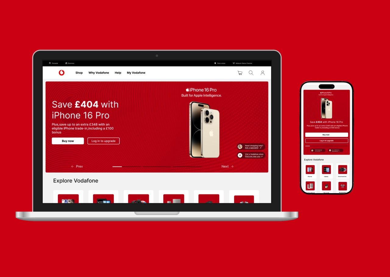
The design was built responsively to ensure a smooth and consistent experience across devices. Key components were adapted for smaller screens with simplified layouts
Outcome
This redesign significantly improved the clarity and usability of Vodafone’s shopping journey. Through simplified layouts and well-structured content, the design better supports user goals—making it easier to discover devices, compare offers, and proceed with confidence